Website Development
As technology progresses and new devices are made, those who are tech savvy need to find ways to make their website applicable to the variant ways their audience may view the web page. The way we can make this website usable through different devices is by making it responsive. Responsive web design allows many different devices to display the website or app in an appropriate way that the audience would be able to view and use despite the size of the screen. This can be used through headers, images, grids, and layouts. The designer can accommodate the sizes to the user’s preference. You can learn how to create a responsive webpage in the next four easy steps.
Step 1: Set Size For Each Device
In order to set the sizes for each device, we must have a responsive breakpoint, and they can be defined in CSS. The website will respond to these breakpoints, and they will adjust according to what was commanded. Some of the most commonly used sizes are 1920x1080 for windows, 360x375 for mobiles, and 1536x864 for tablets. There are many more that can be seen on the internet.
Step 2: Begin The CSS Fluid
CSS fluid is similar to pixel measurements; however, the layout allows the designer to see what is displayed to each of the devices. Therefore, it positions the elements on the website to resize. CSS fluid helps with consistency and alignment throughout each of the devices.
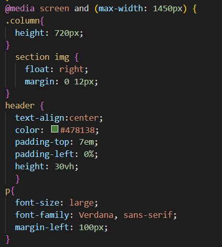
Step 3: Code For Responsive Design
The code for the sizing can be done in two ways: HTML and CSS. In HTML, the designer can make the website responsive under the style tab. We can add the position, height, width, padding, top, and left. In CSS, normally it would start with @media screen and (max-width: 1450px) {whatever applies to your website}. To make specific changes to a certain tag, the designer must add a period before the name and make certain changes within the bracket. You can adjust the width to whatever device you want to be responsive. Below is an image of how to do a CSS responsive design:
It’s also important to make images and videos responsive as well. Normally, you can add a div container around the iframe element for the video, and make the adjustments for the position, height, and width.
Step 4: Test Your Responsive Website
The most important step is to test your design. If you skip this step, then you may ignore a big error that may cause your audience to lose interest in your website since they can’t access the page through their preference. Therefore, make sure you test everything, whether that is at the end or as you go. You can check if your website is responsive by right-clicking and clicking inspect. From there, you would see the different responsive options there are at the top of the page. Below is an image of what you should see:

The dropdown box for dimensions provides many different devices that your audience may be on, and you can see what they are viewing by clicking on the options. Once you see what your audience is viewing, you make changes and test if it made the right changes.
---
This post was written by Entisar Yahia at https://www.linkedin.com/in/entisar-yahia-904915186/